Colors are an important part of design. They assist with taking action, guide the eye and highlight important information. They also emotionally connect with the users on multiple levels.
Knowing colors is essential for UX/UI designers and this is where the 60/30/10 rule comes in.
The 60/30/10 colors rule in design
The 60/30/10 is a powerful guideline for creating visually balanced and basically good looking user interfaces.
This is a great starting point for anyone looking to improve their UI design skills and have some uniformity in their designs. It's also surprisingly easy to use when you pick the right colors.
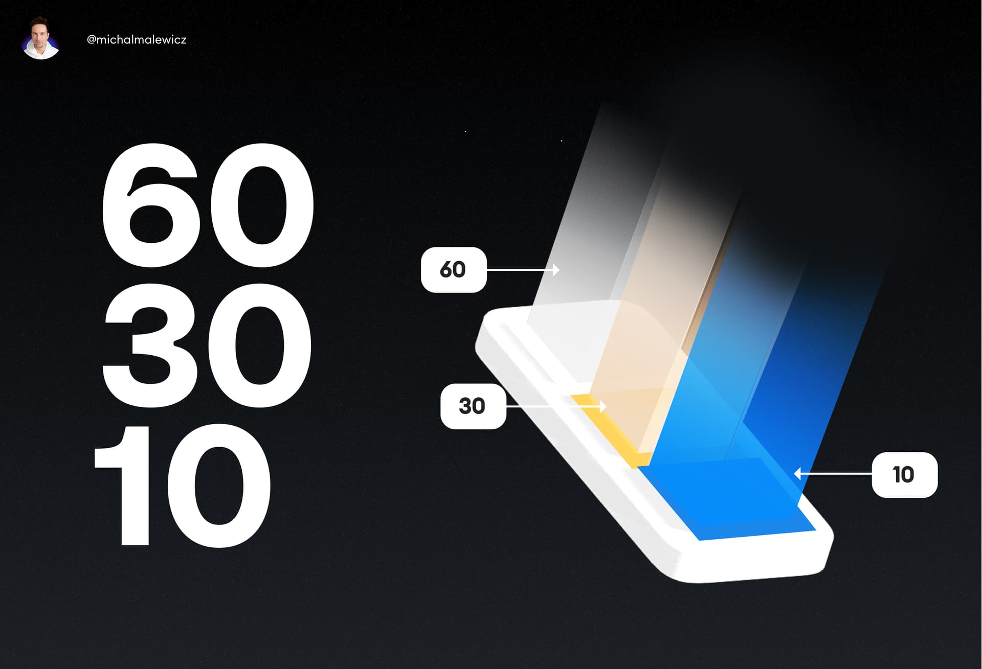
What is the 60/30/10 rule?
It comes from the color theory and has been used in interior design for decades.
60% of a palette should consist of a primary hue, 30% is for a secondary hue to support it, and 10% is dedicated to one accent color, to give it life. That "life" is also the focal point of most interfaces, which means that accent color should be the brightest, most vibrant of them all.
At least in most cases.

Real-world usage
In this example take a look at how:
- 60% of the room consists of a primary color
- 30% of it has a secondary color
- 10% is a strong accent color to make it pop

The room itself uses warm, calm hues all over, but the accent color of the yellow chair makes it instantly stand out. It catches attention.
It's the centerpiece. The "call to action" of a room if we're going into the design terms.
If all the colors were vibrant and punchy like that, the entire room would look messy, unorganised and chaotic. But with just one strong color it just works.
This rule works for both interior design, exterior (architectural) design and also all the things that we do here. User interfaces and websites.
The rule in User Interfaces
Let's make a quick, simple card UI example to illustrate this.
Take a look at how:
-- 60% of the card consists of a primary color
-- 30% of it has a secondary color
-- 10% is a vibrant green that stands out from all the other hues

This approach makes the accent color instantly visible which makes it easier and faster for the user to take action.
This is especially important when the average attention spans of people in 2025 are below 8 seconds. We need to guide their eyes to the right buttons fast!
Notice what would happen if we went with a muted, monochrome palette instead. In this palette all colors are similar, only varying with the lightness level. And while they all do match each other nicely, the button disappears.

One thing to note in dark mode is to avoid oversaturated colors. They tend to be a bit too-high contrast, making it straining for the eyes to look at.
We don't want cognitive overload of any kind for our users.
That's why the majority of a good user interface is simple. Either white, or dark grey for dark mode, with contrasting typography and a single, vibrant accent color to make those buttons irresistible to click.
Keep that in mind and you'll be on your way to cohesive, beautiful and functional UI's. When learning UX/UI design it's really good to not overdo colors. Keep it simple and use the 60/30/10 rule for best results.
Liked the article? Share it!
