

Course outline
3:54 min
1. Introduction
How to make websites responsive?
27:36 min
2. Responsive Navigation
All the possible ways to create responsive navigation that makes sense for the project
29:35 min
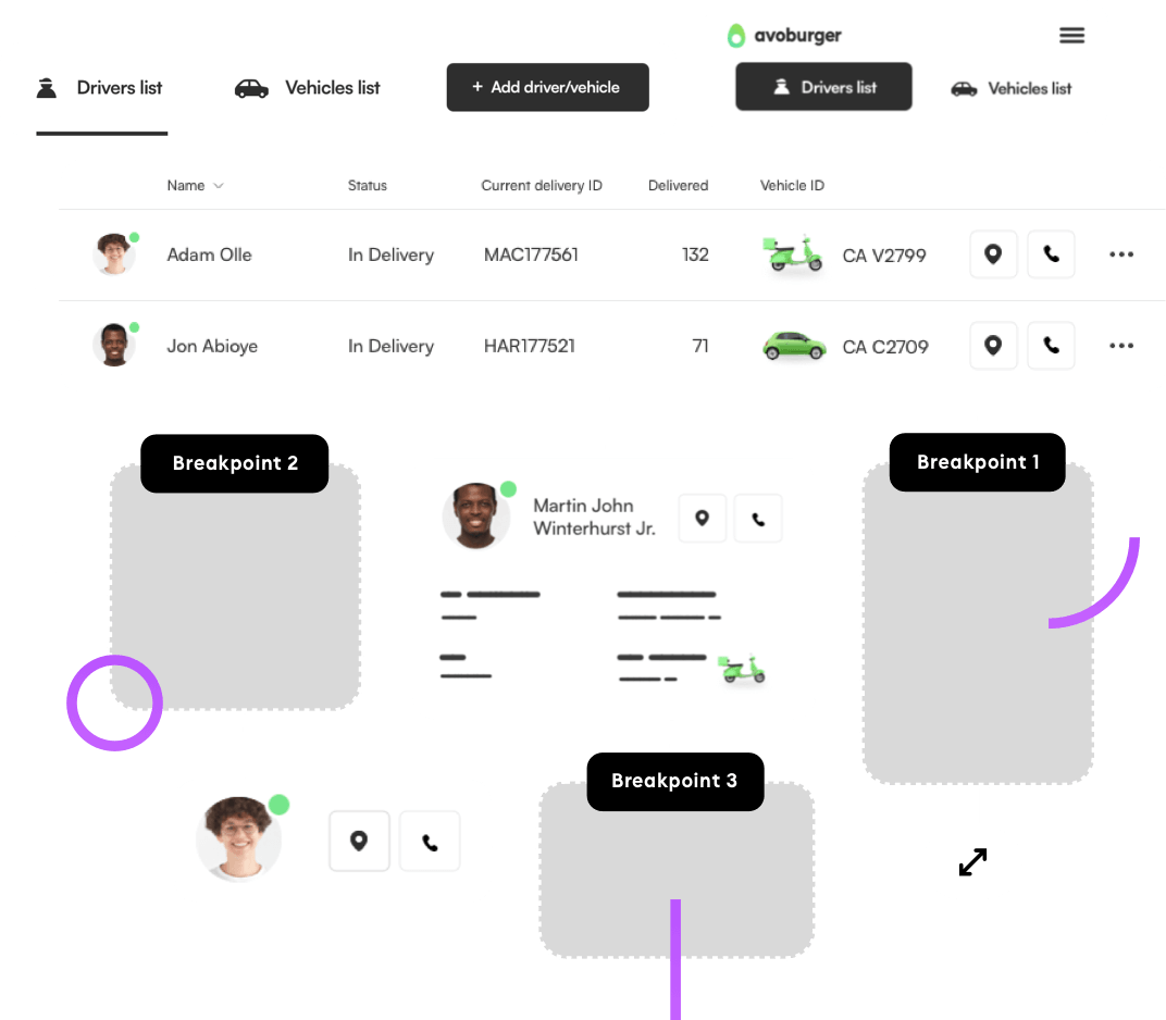
3. Responsive Dashboards
How to plan and execute a complex responsive dashboard that makes sense for the user.
34:54 min
4. Responsive Data Tables
Plan responsive data tables from complex to super simple in a way that fits the product context.
22:23 min
5. Forms, Map Views, Cells
How to handle forms, large scale map views and displaying visually engaging cells.
46:10 min
6. Complexity in Landing Pages
Make a complex landing page responsive by identifying what should be responsive in the first place.
27:20 min
7. Mobile Experience context
A mobile experience doesn't mean everything has to transfer from desktop the same way. Learn how to approach it.
15:18 min
8. Landing Page Header options
Custom cutoff, multi-decoration and simple photo background headers on mobile devices.
17:58 min
9. Bonus: Tablet and TV
How to design websites for tablets, tv's and why FOCUS is very important for the latter.
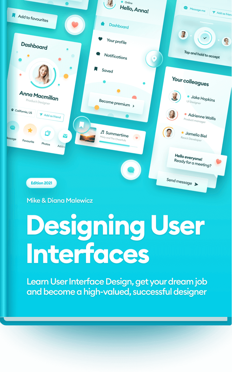
Get Designing User Interfaces 30% cheaper using the code: webdesigner30 ☝️
What will you learn after the course?
Breakpoint thinking
Understand breakpoints and plan the layout not just to fit within it, but to make sense and create a full, ready to use and beautiful looking experience.
Red Square Method
The best alignment technique now comes to the web with some tweaks to work with both larger and smaller canvas and around the visual decoration.
Small screen experience
Learn when to modify the design, remove sections or merge them in creative ways. Work with data tables based on what they’re used for, so they’re fully usable.
Layout, grid and more
Learn how to structure the layout, font sizes and grids from larger to smaller canvas. How to use whitespace to your advantage, so the project never looks boring or empty.
My workflow
I show you my workflow, including some unique design patterns that come from 20 years of commercial experience. Responsive design is all about having the right plan!
What is SquarePlanet?
What is SquarePlanet?
It`s an educational platform with both paid and free content for designers and developers. We will be adding new featured, articles and materials in the coming weeks.
Want to stay informed about new courses & books?


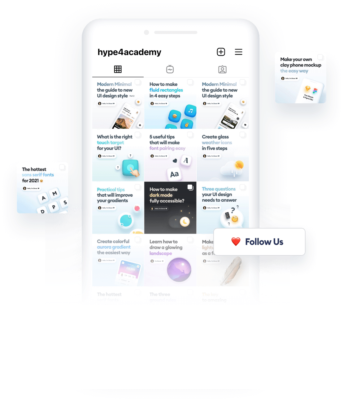
Psst. We post very cool content on our Instagram:
@malewiczhype
News from the designer world packed in quick and helpful tutorials, that you won’t find anywhere else. Follow us to grow as a designer!
100% positive reviews: ⭐️⭐️⭐️⭐️⭐️ (4.98)
“This book is the best.👏❤️ Still reading and I love it.”
@uiraygan on Instagram

Our newest book! 🎉
Learn how to become a successful developer and earn more money!