
Daily UI Challenge #6
Show feedback
 👑
👑Hello, become a PRO.
For just $8/month you can get guided challenges and AI design feedback, your individual -40% promo code on all courses, premium articles, videos and invitation to exclusive events.
❗️ Prices will increase soon due to high demand - order now to secure the current prices.
3 comments
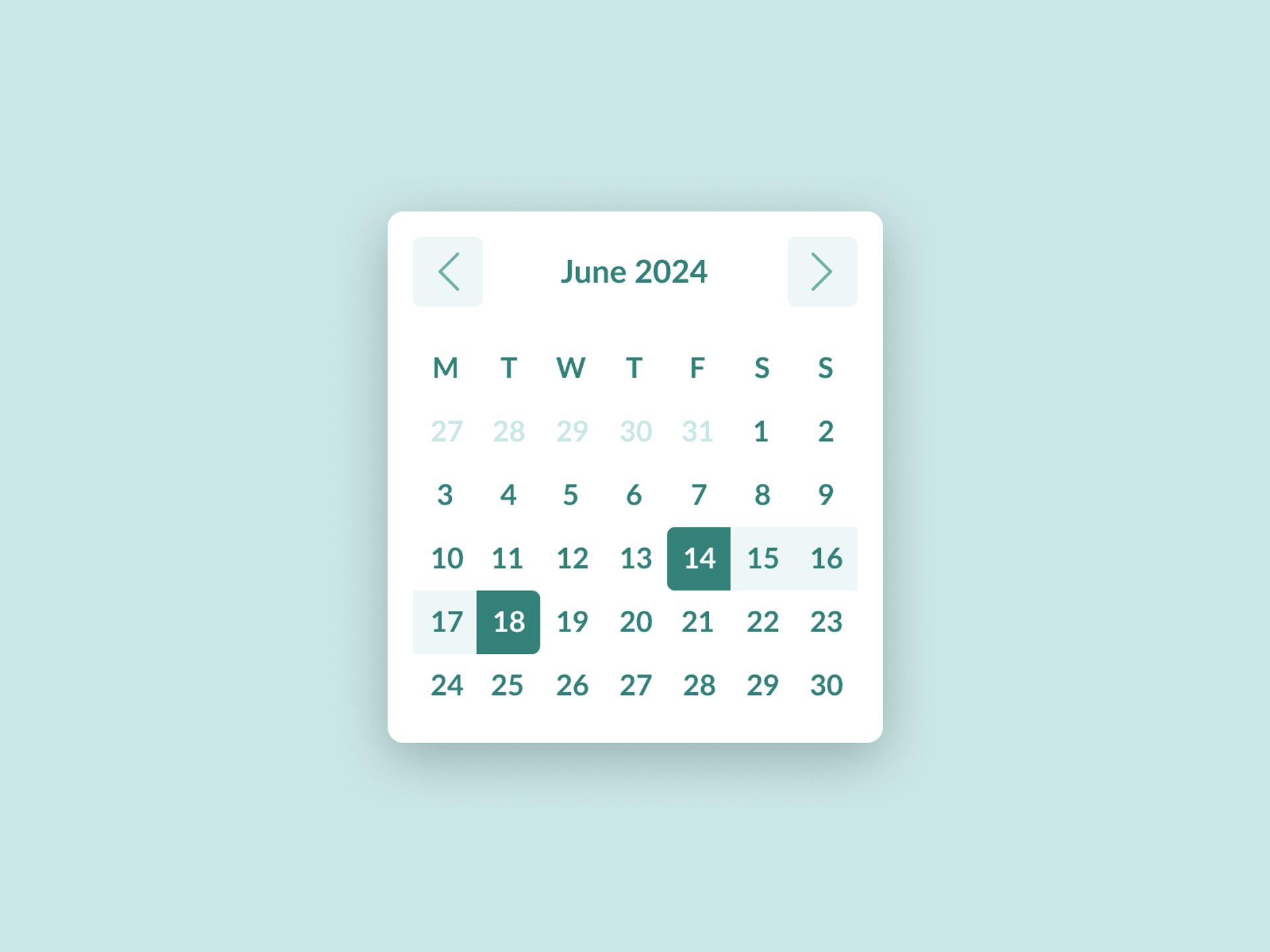
I calculated bottom margin under the last row of numbers from a square that would be coloured when this day is selected so if it's not, it looks like there's too much white space at the bottom but then there would be none if the square gets selected.
It looks okay as of now too, the selection indication is what makes us need some extra space at the bottom or else it would look too close to the edge
Thanks Adam and Abdul for the feedback.


