Doherty Threshold or simply Instant is good!
The shorter we wait, the more engaged we are. And we're the most productive, when there's no visible lag between what the digital product shows us and our actions.
Sometimes, however, it's inevitable for some data to load. How to handle it then?
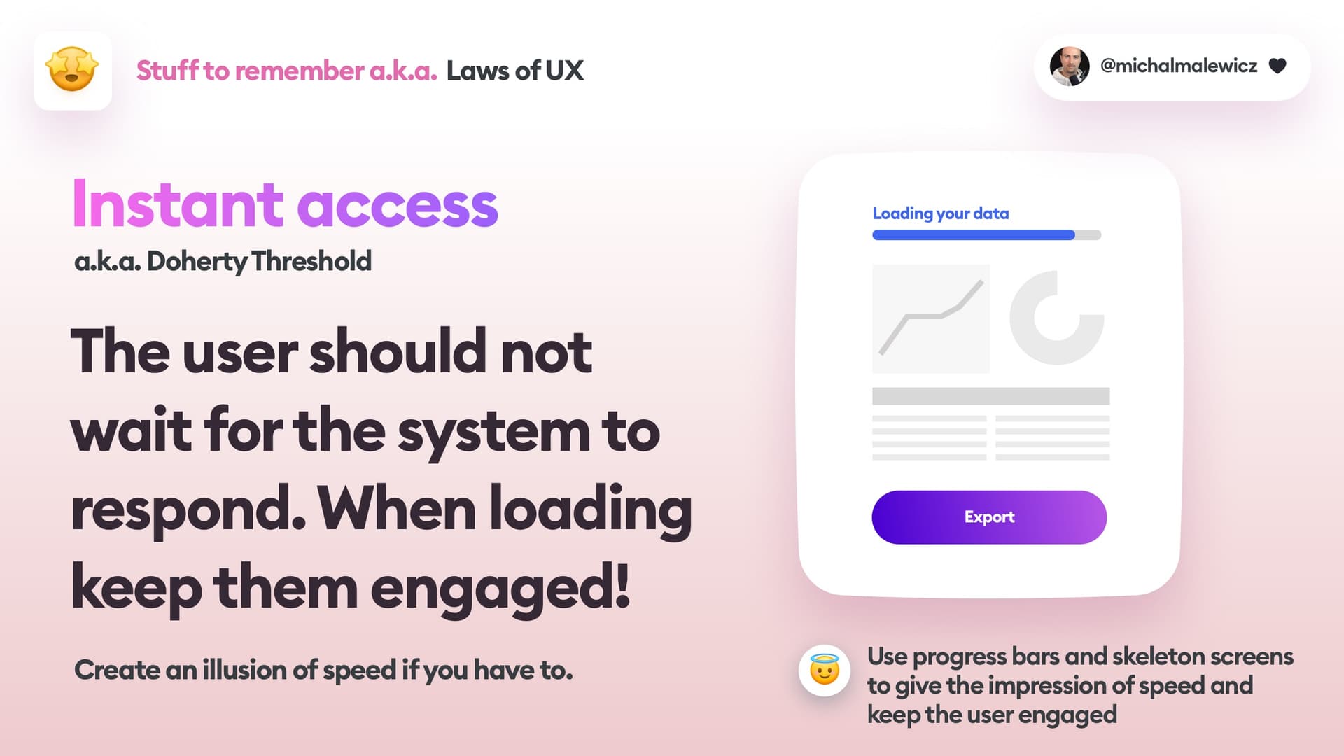
You can reduce perceived wait time in a couple of ways. One way is with progress bars. They don't have to be precise, just the fact that a progress is animating is enough to calm the users and let them know something is happening.
Another great way is using skeleton screens. They're grayed out "layout" blocks before the data loads. Many apps and websites do it and it's the best approach when the data we load has predictable boundaries. So if you're loading a graph, a data table, or a photo with a description, all of these can be converted into blocks. Those blocks can fade in and out a little bit to indicate the real data is loading.
