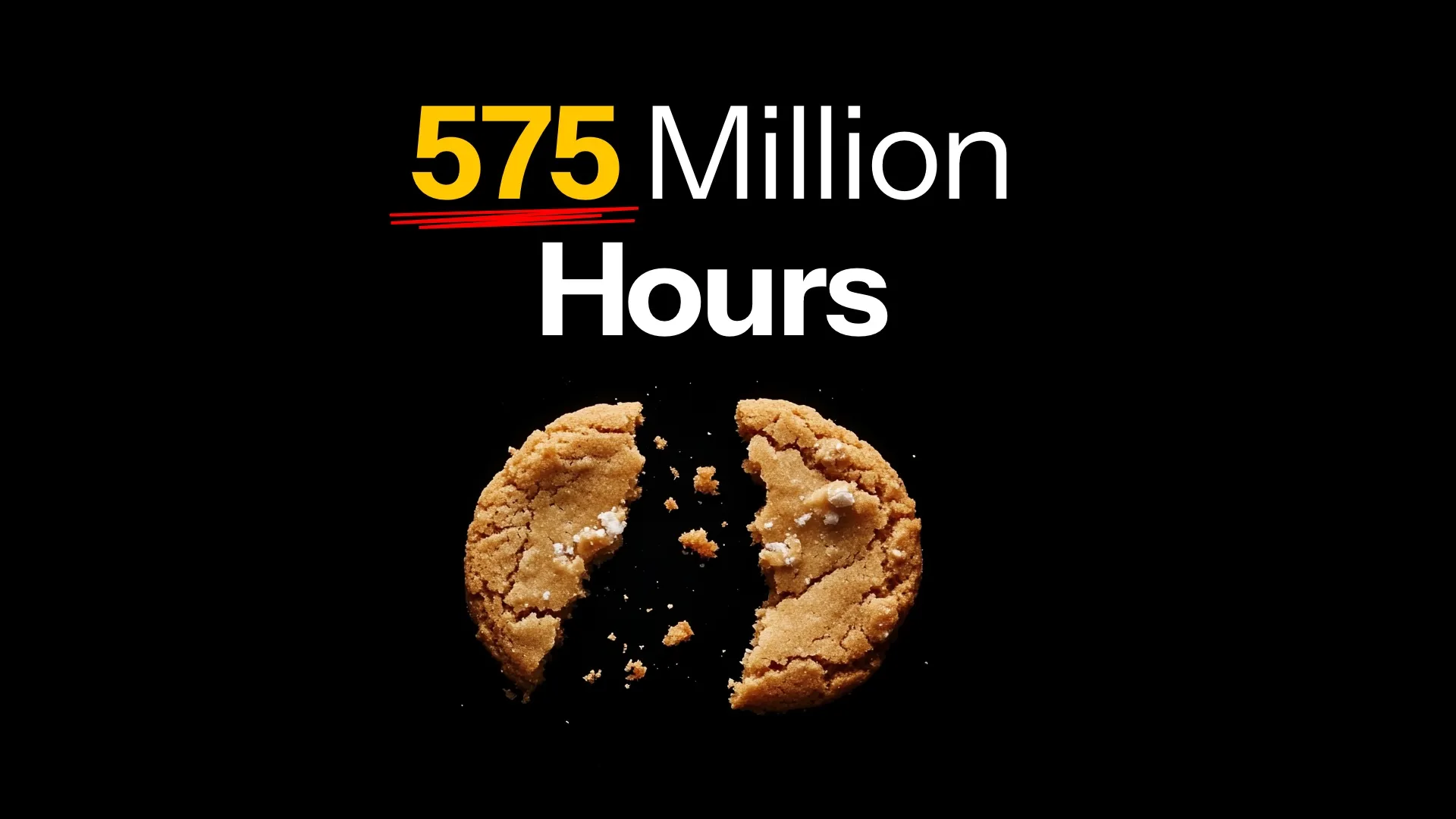
Let’s face it! If there’s one thing most internet users universally hate than cookie banners. And now it also turns out that Europeans waste 575 MILLION hours annually on clicking off cookie banners.
Now, the majority of those clicks is the annoying acceptance to get on with your day and get to the website you wanted to read.
I decided to fix this, share my thought process, and while I’m at it show you how to optimize popups, popoves.
and newsletter signups so they don’t annoy people.
Do you know the 3° rule? If not, let’s dive in!

(This image next to the newsletter signup is rotated. And it’s 100% on purpose.)
Cookie banners
The idea to show cookie banners came from the EU parliament. Now imagine a group of extremely non-tech-savvy people in a room. They get paid around €14K per month to sit and vote on things.
They voted on the hilarious banana curvature rules for example. And yes — I know — this example is greatly exaggerated and it makes sense to regulate fruit quality. But it also shows the extent of absurdity that happens when you don’t consult the decisions.

They probably had good intentions. Online brands are notoriously tracking the users. Your private data has become the new currency. We’re being watched during every online action.
Adding a cookie banner to a website results in more people being aware of the tracking.

How did the experiment go?
We’ve had cookie banners for a while now. They did raise some awareness but I’d say it’s been a huge failure overall. It adds to the cognitive load and wastes a lot of time.
Is there a better way to solve it?
Yes. Yes, there is.
First, we need to define the problem.

The main issue that causes all that lost time is the shift of focus from the content of the website to the cookie banner. Some banners also require you to select specific cookies one by one, thus wasting even more time.
The majority of people just click accept. It’s an annoyance like a buzzing mosquito. Nobody reads what’s in the box.

Because everyone does the cookie banner on their own, they differ in style, position, button types and more. The user is never ready for a unified experience. Instead, it’s a constant surprise.
What if this was handled by the browser instead? When the idea hit me I started sketching it right away and came up with this:

My idea is to let the cookie banners be handled by the browser. You get an icon, the cookie name (or issuer) + a quick AI explanation of what it does.
You can also go a level deeper to read more and have a toggle to turn the cookie ON or OFF. This is how it could look in higher fidelity.

Simple. Safe. Unobtrusive. The popup doesn’t appear until you click on the little cookie icon.
Why Auto-accept?
Most cookies out there are from well-known issuers and the browser can auto-accept those based on your overal selection — saving you hours.
Sometimes, however, some bad actors can try to sneak a cookie into your jar. What then?

In that case, the cookie icon in the browser bar turns red. The suspicious cookies are automatically blocked.
Then, clicking on the red icon can reveal more information and prompt action. Because giving users choice is important, they should be able to turn on even potentially harmful cookies.

This example imagines an option where some cookies were blocked and some other ones accepted. That also simplifies the matter as it can handle all kinds of tracking systems — not just cookie-based ones.
I grouped them together as cookies for simplicity.
Potentially bad, suspicious, or unsigned cookies are automatically blocked. They are parsed by the browser behind the scenes and sent to an AI for analysis. Clicking the chevron near one of them takes you to a detail page.

Save 574 Million hours?
If we could save 574 of the 575 Million hours each year it would be a huge boost in productivity. Something European companies desperately need as they’re falling behind both the US and Asia.
Shifting the focus to the browser and making it automatic should be the path to go.
But this is not the whole story when it comes to popups.
How to do better popups?
Every time someone asks me a question about making better popups I respond with the same thing.
Don’t do them unless you REALLY have to!
Popups are a pattern that is rarely beneficial and in most cases just break you away from the flow.
Sure — there are those rare cases like confirming a destructive action that do need the user to slow down and be sure.
Marketing team’s misuse of popups
But the most common popup out there is this kind:

Oh, the infamous newsletter signup popup. Modern marketing, driven by chasing numbers just loves this little pattern.
The problem with it is that it’s a little too effective. Some users get annoyed. Others, lured by a potential 5% discount enter their email into the box.
In most cases, however, tricking people to sign up this way leads to an email list full of uninterested prospects.

One solution here is to connect the newsletter signup closer to an actually useful context.
In the case of an educational website, it’s really easy.

You can add a field like this within an article. If the CMS block is done right, you should be able to write custom copy for each article so it feels relevant for the user.
In this case, if the entire article is about Layout, the title can say “Get Layout guides weekly!”. In another article, the title can be different.
The rest of the copy structure is pretty obvious, but there is one thing here that’s worth mentioning.

The angle of the image.
Why is the envelope rotated? Wel,l it’s not only rotated but also sticking outside the bounds of the main content container.
What it means is that optically it sticks out more to the left side of any text block or image on the page. The rotation adds another layer of differentiation. Our brains naturally stop at spots like this.
That gives us time to process and consciously sign up.

The trouble with an X
If you REALLY, really need a popup though, there are some things to remember.
Rule number one is: clicking OUTSIDE the popup closes it. Easy.
But the thing that’s causing the most anxiety when it comes to popups is the little X.
It feels like a competition to make it as small as humanly possible. And the users are losing in that competition.
There are even memes about it.

The idea for the smallest possible close button is obvious. We don’t want users to close the popup. We want them to sign up.
But it is a bit like forcing broccoli on a 4-year-old. You can try, but you’ll likely fail. And then, long term they won’t trust you with the spoon being an airplane.
Here’s how you solve it.

Have a big, juicy close button with an actual clickable area. Not just a tiny x. This can be an outline or a fill. Whatever it is it needs to visually communicate that it will be really easy to click.
That removes the anxiety. Users now know that if they want to close it they will have absolutely no issues with it.
This also shows you’re confident that you don’t need to trick them.
You may get a few less subscribers, but you’ll end up with better ones if you respect them like this.
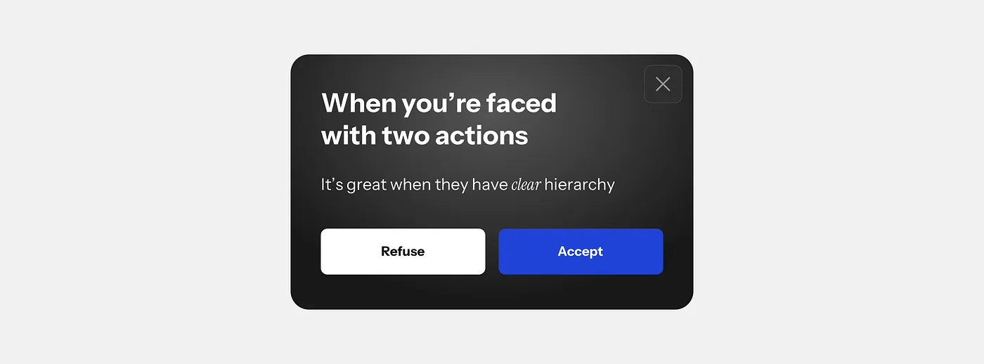
The Two action dillema
Another thing is the classic two-action dilemma. There often comes a point where you give your user two choices. Sadly — way too many websites still make the same mistake when it comes to picking an action.
They make both buttons look exactly the same.

I’ve seen a banking app have “accept” and “reject” transfers look exactly the same. Many instances of clearly one action being preferred, triggered or more important, yet looking exactly like the other one.
The solution here is easy. Just add hierarchy to the button. Which action is the important one? Which one is secondary? Communicate that and decrease the cognitive load.

Now there is a catch. Apparently, the EU enforces both buttons in cookie banners to look the same exactly for that reason. If they look the same you need to pause (and waste even more time) for longer. You need to be 100% sure what you’re clicking.
This issue, however, persists in many other interfaces out there — not just popups.

Always remember to have a clear hierarchy and guide the user.
We’re not there to confuse them into performing an action. We’re there to solve their problem and deliver value. This is what they pay us for.
You can watch my full thought process in a recent video and see how I think about problem-solving.


