The primary purpose of a landing page is to convert users into customers. In short: it’s all about sales!
Today I’ll challenge some of your perceptions about what works on websites and what doesn’t, yet most people think it does.
This is based on over 500 hours of HotJar recordings viewed and countless websites we created at Squareblack for practically every product category.
On top of that 400+ websites I analysed from X creators — some of them very popular.
Some are also pretty good.

I’m not going to be overly scientific. I want you to understand and rethink your approach to websites, and then find your own path of making them better.
But there is a foundation that works.
It all starts with a hero
Hero sections are the first thing your customer sees.
The first impression.
And the thing that should 90% convince them to buy already. A good hero section is then supplemented by other sections that have the purpose of clearing doubts.

The purpose
Contrary to some popular beliefs, the hero section isn’t about sparking curiosity or being mysterious. You shouldn’t be vague and artsy and count on people to scroll down for explanations.
We’re all busy and so are your potential clients. If you don’t show them it’s what they need right in that hero section they’ll click off.
Sale: lost.

How modern design is being done
I analysed over 500 modern web designs this month. Mostly done by the X community of designers. Many of them are pretty good, but there is a concerning amount of completely counter-productive examples posing as good design.
This is how you can spot the red flags.
Designers start with an AI-generated image. It’s either some landscape or an abstract shape. They usually also add a glassmorphic menu at the top but we’ll skip this step for clarity.

2. Step two is to add the headline, description, and CTA button. First, let’s take a look at the style. In this article, I used a certain popular font on purpose, because this is exactly how those headlines look like most of the time.

3. The most important thing is to find the right, smart-sounding words for the headline copy so that the user is wowed instantly. Not only is the image in the background beautiful but look at those seamless, transformative word salads!

I can tell you right away that if you see a headline with TWO of these words in it, the chances of it being human-generated drop to 0.
It’s a word salad posing as something sophisticated. But what it also does is confuse the user.
Words fit the visuals
What happens with this kind of design is the words are an afterthought and are meant to fit the visuals. Their size, position, and word-wrap come directly from the image.
That’s how we end up with nonsense messaging that’s only supposed to look good.

Run!
If you’re thinking to hire a designer with mostly this kind of stuff in their portfolio, chances are your sales are actually going to decrease even compared to your previous “less sophisticated design”.
Ok. Now, we know what’s bad, so how do we make it good?
Start with a typeframe, not a visual
When working with some really big clients, with huge marketing teams we quickly realised that the typical approach to building landing pages wouldn’t work.
There were two main risks involved. One option is to do a high fidelity right away and face a potential time wasted with a complete redesign.
Another is doing a low-fidelity wireframe and face most marketing people not understanding why it’s so ugly, and undermining all your future design efforts.
There is a third path
Sometime in 2016, I coined the term Typeframe. It’s a low-fidelity wireframe with high-fidelity text.
What it means is that all the copy is already in, nailed, and structured in a hierarchical fashion. All text has the right size and spacing that supports hierarchy.
Here’s an example:

The first exercises in tailoring the message start by figuring out WHY the client should be interested. Then crafting 3–5 versions of the copy and testing the first responses locally (not on the internet).

The exact phrasing and words used should be adjusted to fit the industry. There are no special words or phrases that work.
The main idea is clarity for the target user. They need to instantly understand how they benefit from the product or service.
If you don’t show them it’s what they need right in that hero section they’ll click off. Sale: lost.
When using proper font sizes, hierarchy, and spacing it’s a lot easier for both the agency and the client’s marketing team to figure out the messaging.
That happens before ANY colorful pixels are put on screen.
Let’s talk visuals
Only then, when this part is completely figured out, can we start thinking about what is the best way to visualise the copy.
It’s not about “looking pretty” though.
The key visual is all about confirmation.
The user reads your claim and that visual should amplify that message.

Humans vs abstractions
99% of businesses will benefit from using a human in their hero image.
That’s because we naturally align with other humans. We want to emulate what they do. It’s easier for us to imagine ourselves in their situation.
There are some industries in which this doesn’t matter but they’re a minority. Emotional connection with the hero is essential to grab attention.
Of course, it has to be done right — in the context of the message and matching it.
Adding random people to the header can quickly become a distraction.
Adding popular, stock-photo people can also lead to the “I’ve seen this before” effect, but not in a good way. When a photo is clearly stock the trust towards the brand falls drastically.
The best approach is to have your own photos for your own brand, generate some with heavy tweaks to match your styling, or greatly modify the stock site ones.

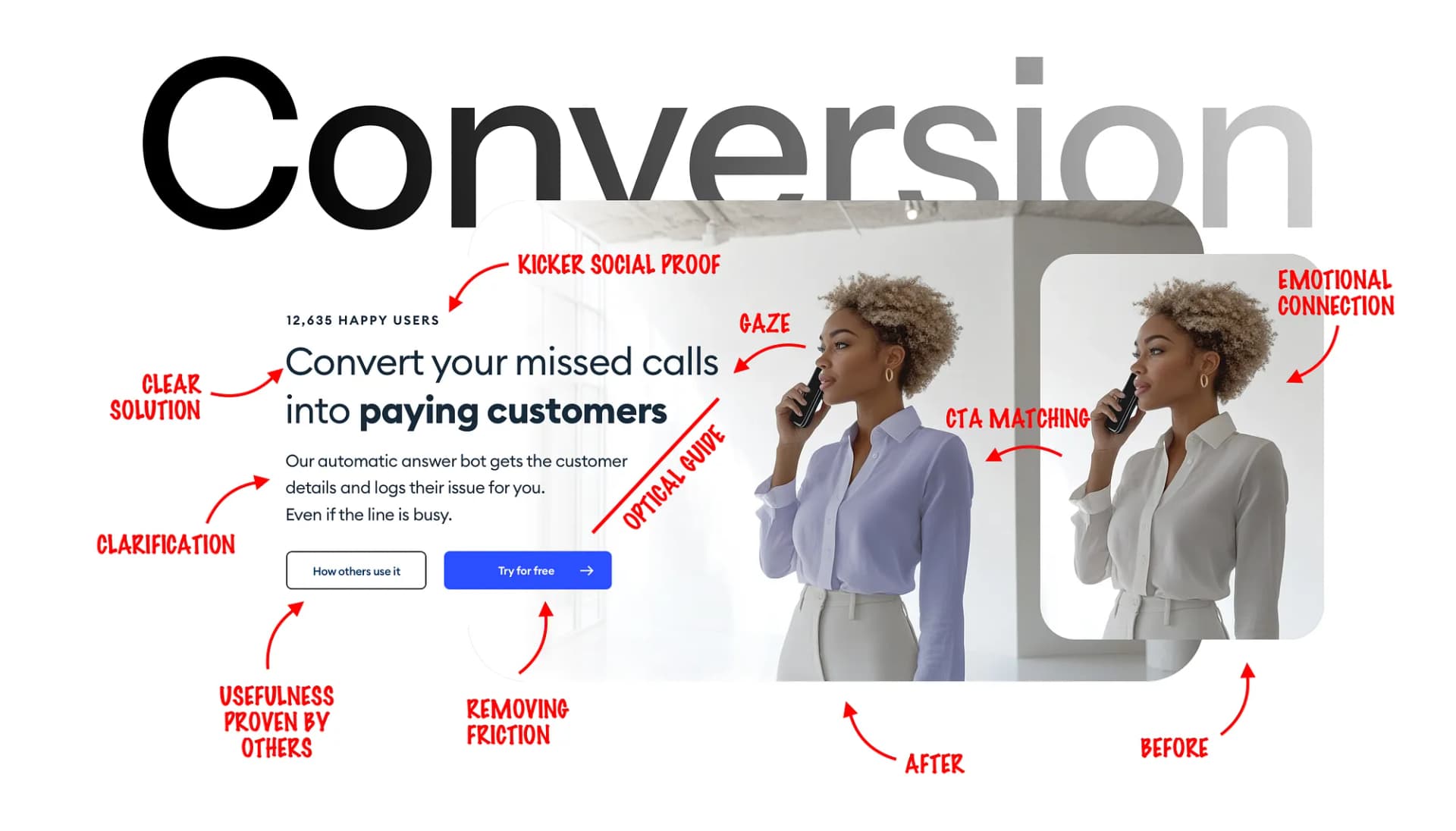
Saving you time and money through fewer missed calls? Show someone on the phone a label showing that it converted.
Be creative without being unclear. Less is always more.

Color Matching
When you already have a color scheme, you can recolor parts of the image (like the person’s clothing) to a slight hue of the main CTA to reinforce the connection.
At Squareblack we sometimes even recolor the eyes of the person, but well… we’re obsessed.
When recoloring make sure to only highlight one piece of clothing, not have the person have a monochrome “uniform”. In the example above it’s the blouse and the recoloring is subtle.

The gaze principle
The gaze principle is something I covered multiple times before. In short: it’s a primal instinct of always looking at things someone else is looking at.
Basically it’s following the gaze of others.
When the person in the photo is looking directly at the camera, most of the attention goes towards the eyes. But having the person look towards the CTA shifts that attention exactly where we want it.

The guiding lines
The gaze principle forms the first guide from the person's eyes towards the headline.
But notice how the lines are broken in the text. It forms a natural diagonal line that goes down towards the buttons.
It flows naturally.
Changing it this way makes the whole path a lot slower.

Content sections
Now let’s quickly go through the content sections and see how they’re structured and why.
For this, I’m using another method I created called Hierarchy Strips.

Here’s the five main elements of the hero section.
Kicker, in this case in the form of a social proof. Showing the number of clients is one of the most convincing techniques for the kicker.
Main headline. It has to be brief and VERY easy to understand. Show how you’re solving their problem.
Once they see you can solve their problem, show them how in the description. Be brief and you can clear one or two most common doubts there (what if the line is busy?)
For most projects have just one call to action button that directly leads to the sales process. For high-tickets, high-friction industries (expensive or hard to set up) add a secondary one to showcase other companies using it as case studies.
Emotional connection (can also work with small overlays showing a solved problem — like an appointment scheduled when the line was busy)

Blueprint?
There is no true blueprint for a highly converting landing page. There are fundamentals to follow and an open mind ready to research and test assumptions.
The main thing is clarity and a logical structure.
Then testing and working on it from a typeframe first, so the visual is connected to the copy the right way.
There’s of course more and we’ll cover the different guiding principles next time.
Did you know that showing your SaaS app under the main headline may not be the best idea? I know! Everyone does it!
Next time!


