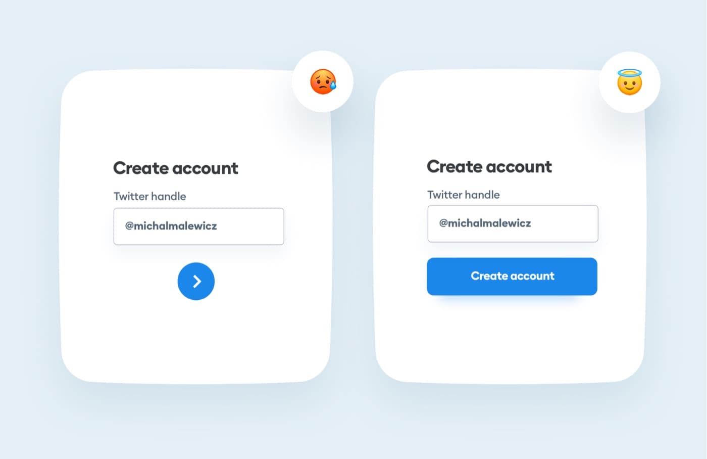
The button should look… like a button. Avoid very round shapes that may be confusing to some users.
Rectangles or rounded rectangles are always the best choice.
Non-rectangular shapes take longer to be understood as buttons.

In order to log into your academy profile, please provide your email and password

The button should look… like a button. Avoid very round shapes that may be confusing to some users.
Rectangles or rounded rectangles are always the best choice.
Non-rectangular shapes take longer to be understood as buttons.