close menu button
👋

Hello there!
Log into the academy:

In order to log into your academy profile, please provide your email and password

Forgot password?

Did you previously use

Don’t have an account yet?

CTA

twitter iconlinked in iconfacebook icon

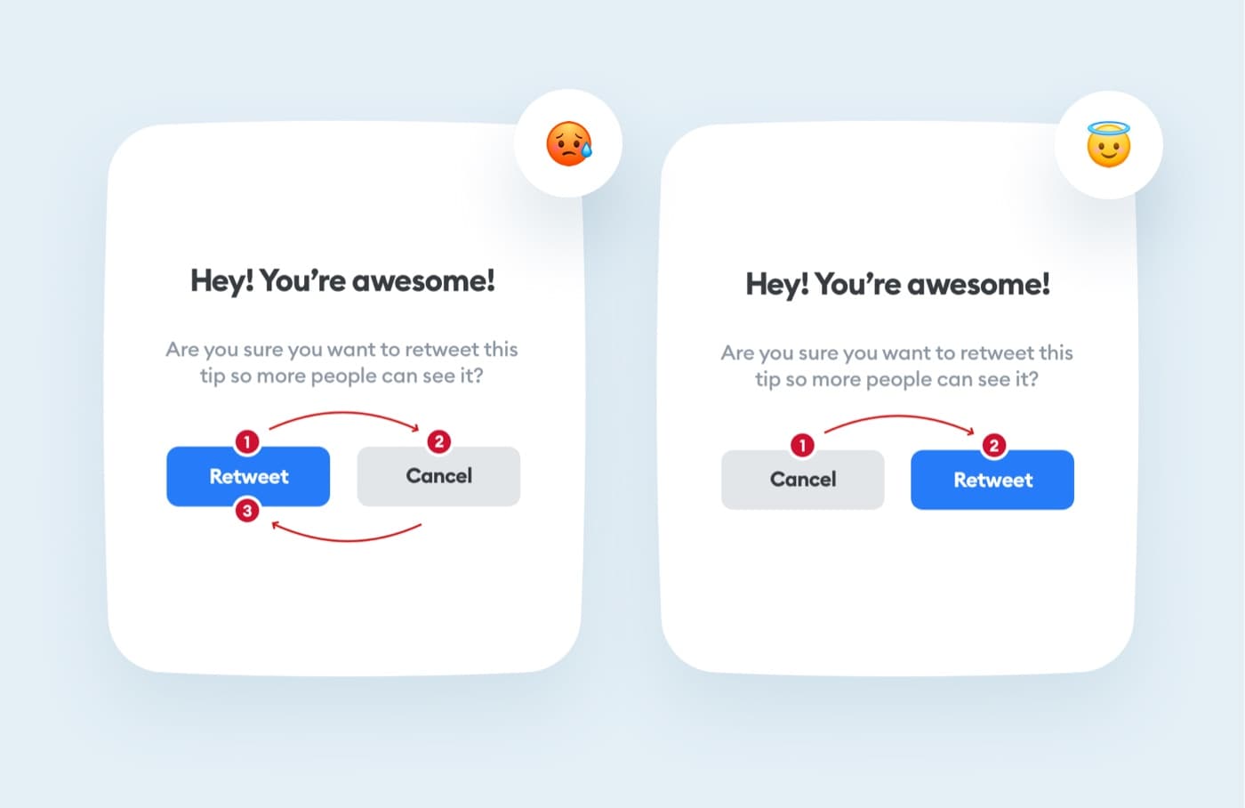
If the CTA is placed in the wrong place, it makes it difficult for the user to navigate smoothly through the website or application.

So it’s slighly better for the main action to be at the bottom.

With the main CTA
 higher we have to 
go back to it while
 scanning.


Liked the tip? Share it!

twitter iconlinked in iconfacebook icon